There are two methods of making a custom form:
- Import a form from the Incisive Forms library and modify it; or,
- Create a new form from a blank page.
Creating a new form
- Go to Setup > Templates > Forms > Field Forms
- In the Local Forms panel click on the New Form icon
- Give the form a Name and Description
- Set the Page Size
Import a background image
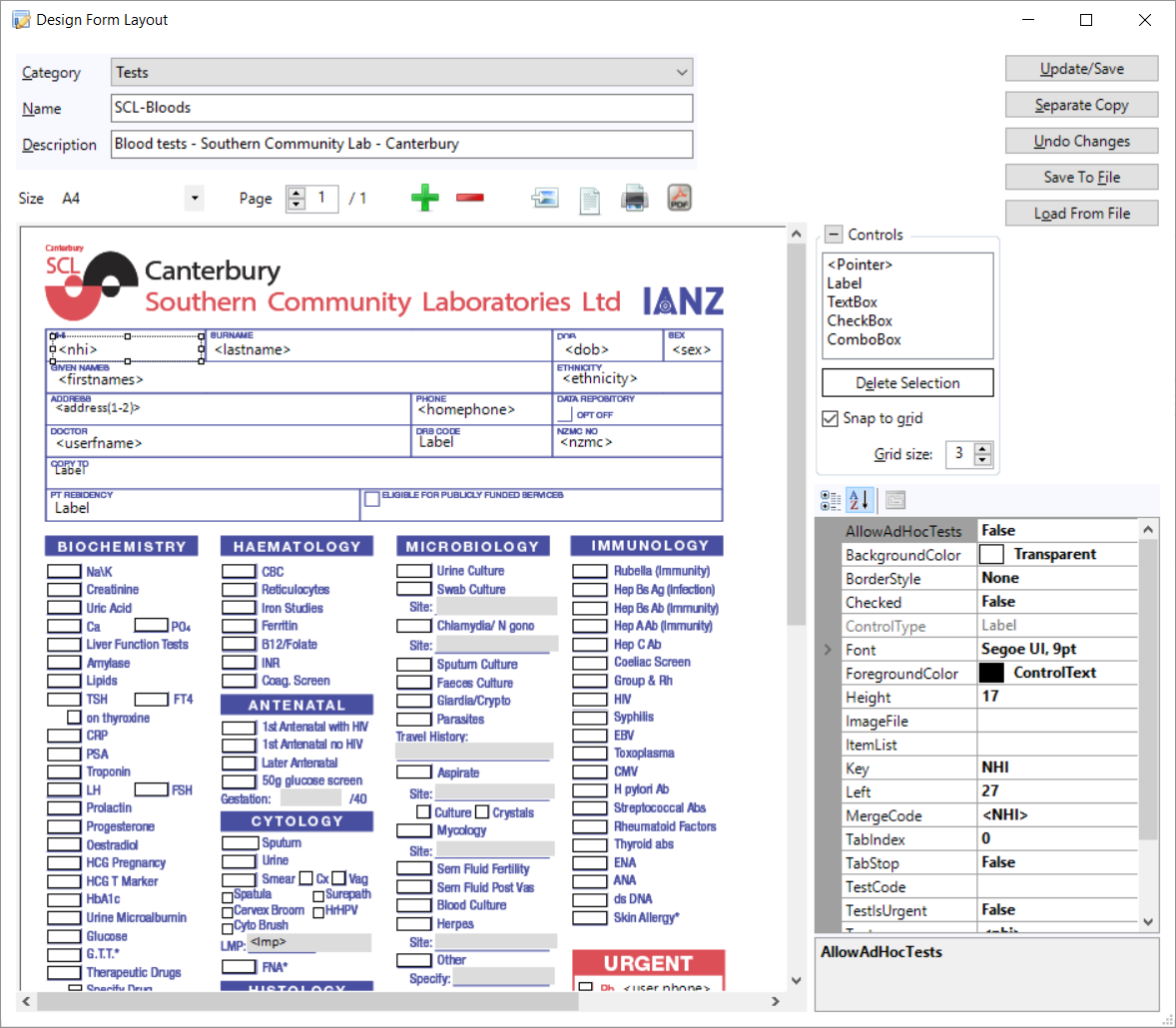
If you are building a new form for internal use you may not want to have a background image - and that's okay. To add a bit of colour or emphasis to the page just use a Label and give it a BackgroundColour
- Select a Control
Click on the location on the form where you want the control to be placed
You can Click 'n Drag to create the control to the approximate size you want
Reposition and resize the control by either clicking on the control or the 'handles' of the control and dragging it to the position you require, or use the Top, Left, Height & Width properties of the control to accurately position it.
You can select multiple controls if you want to give them all the same Property setting e.g. left-align check-boxes.
Either hold the Shift key down and select the individual controls or left-click the mouse and drag a selection function over the controls you want to include.Click on the Update/Save button to save the form
Page configuration
| Page Size | Set the size and orientation of the form. When you import a background image it will be stretched to fill the page space. |
| Page Navigation | Navigate to additional pages |
| Add or Remove a Page | Add or remove a page from the form. |
| Insert a background image | Import a PDF or image file (png, jpg, gif, tif) into the background of the form so that you can position the control on top of the relevant location. |
| Preview the page | View the form as it would appear to the end-user |
| Print the page | Print a copy of the form |
| Create a PDF of the page | Produce the form as a PDF file |
Control Types
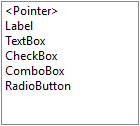
<Pointer> | |||
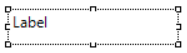
Label |
|
| A Label is used to display text only. it is not used for text entry |
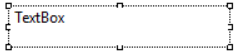
Textbox |
|
| A TextBox is used for text entry. |
Checkbox |
|
| A CheckBox provides a True/False or Yes/No selection option. |
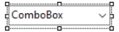
Combobox |
|
| A ComboBox allows you to present a list of options for the form-user to select from. |
Radio button |
|
| A Radio button is usually used for True/False or Yes/No options. |

Control Properties
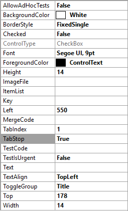
AllowAdHocTests | Used for a TextBox control to add additional ad-hoc Test Items that are not already listed on the form. |
BackgroundColor | A selection list of colours to display in the background of the control. Transparent is available if you want to display the underlying form. |
BorderStyle | Three options to surround the control border: None; Single Line; 3D Line |
Checked | Used only with the CheckBox control to display a tick in the box (or not) when the form is loaded. |
ControlType | Automatically added by the control that you placed on the form |
Font | Select the font type, size, weight and colour to be used in the control |
ForegroundColor | A selection list of colours to display the foreground colours of the control. This will effect the borders and tick colour |
Height | Height of the control in pixels |
ImageFile | |
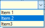
ItemList | Used with the ComboBox control to build the selection list. Place a semi-colon between the list items e.g. Item 1;Item 2;Item 3 etc. |
Key | This can be a unique identifier of the control on the form. |
Left | Distance of the left-hand edge of the control from the left hand edge of the form (in pixels) |
MergeCode | You can select from the full list of F9 Merge Codes and insert them on top of a Label field. Ideal for automatically adding patient name etc. |
TabIndex | The sequence used when pressing the Tab key to jump to the next control |
TabStop | |
TestCode | Select from the list of Test Items that have been added via Setup > Test Orders. Usually associated with a CheckBox control on a Lab Test form. If the CheckBox is true (ticked) it creates a record in the patient's Notes and can also be used the same way as the generic test Order form. |
TestIsUrgent | This is a True/False selection to allow a control to be marked as Urgent in the Incisive Test Ordering system. |
Text | Type in the text that you want to display in the control. Usually only used with a Label or TextBox control |
TextAlign | Align the text to the Left, Middle or Right. |
ToggleGroup | Group radio button or check-box controls so that only one of the 'group' can be True. All the controls in the group must use the same ToggleGroup name. |
Top | Position of the control from the top of the page (in pixels) |
Width | Width of the control in pixels |
On This Page: